.png)
Metrolinx is a government agency responsible for integrating public transit in Ontario. One of its key services is PRESTO, an electronic payment system that replaces the need for tickets, passes, and cash.

My design partner and I collaborating with Product Owner, Senior Business Analyst, and Accessibility Expert
How might we redesign the outdated PRESTO web app so riders can quickly find the information they need?
Started by modernizing the Home page UI
BEFORE
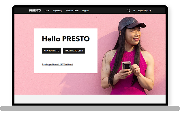
1. Sharp corners creating a less friendly, less clickable interface
2. Unclear images reducing user understanding
3. Poor use of white space affecting readability and layout flow
4. Limited color palette causing poor visual differentiation (example: calls to action)
AFTER
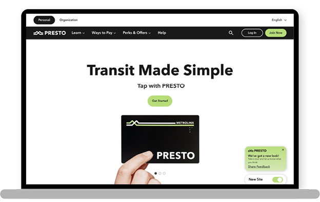
1. Rounded corners making the interface feel more friendly and easy to use
2. Clear images helping users understand content better
3. Better use of white space made the layout easier to read and navigate
4. A more varied color palette following aligned with the brand book made buttons and links stand out clearly
Guided payments options with interactive tools
BEFORE
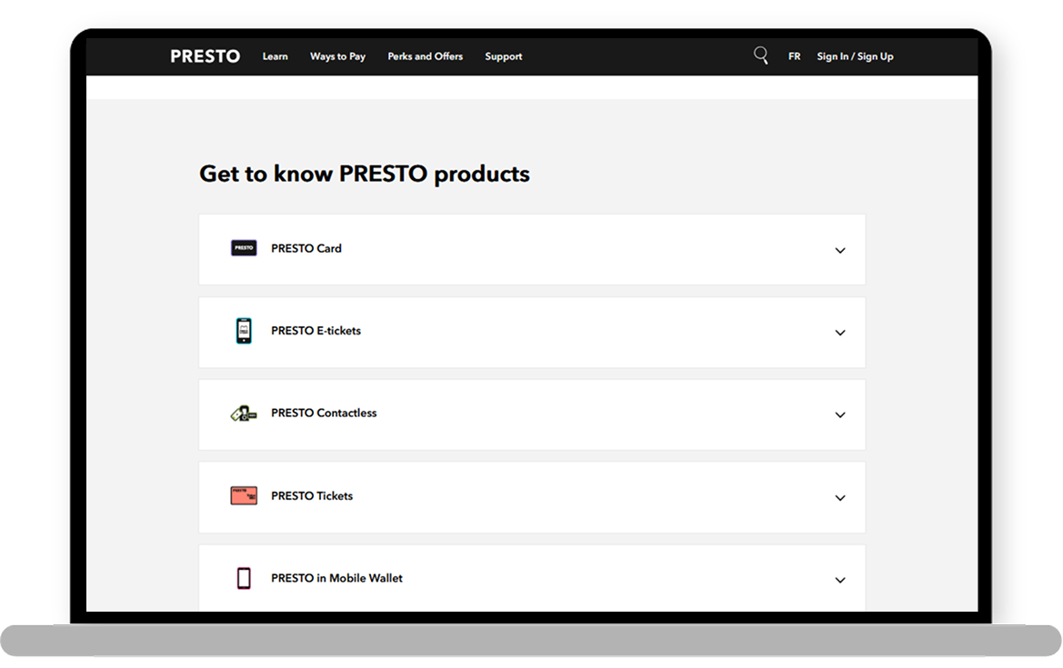
1. Small and unclear illustrations
2. Important information hidden in accordions with dense, hard-to-scan text.
3. Excessive repetition of the word “PRESTO”
4. No clear indication of product compatibility with specific transit agencies
AFTER
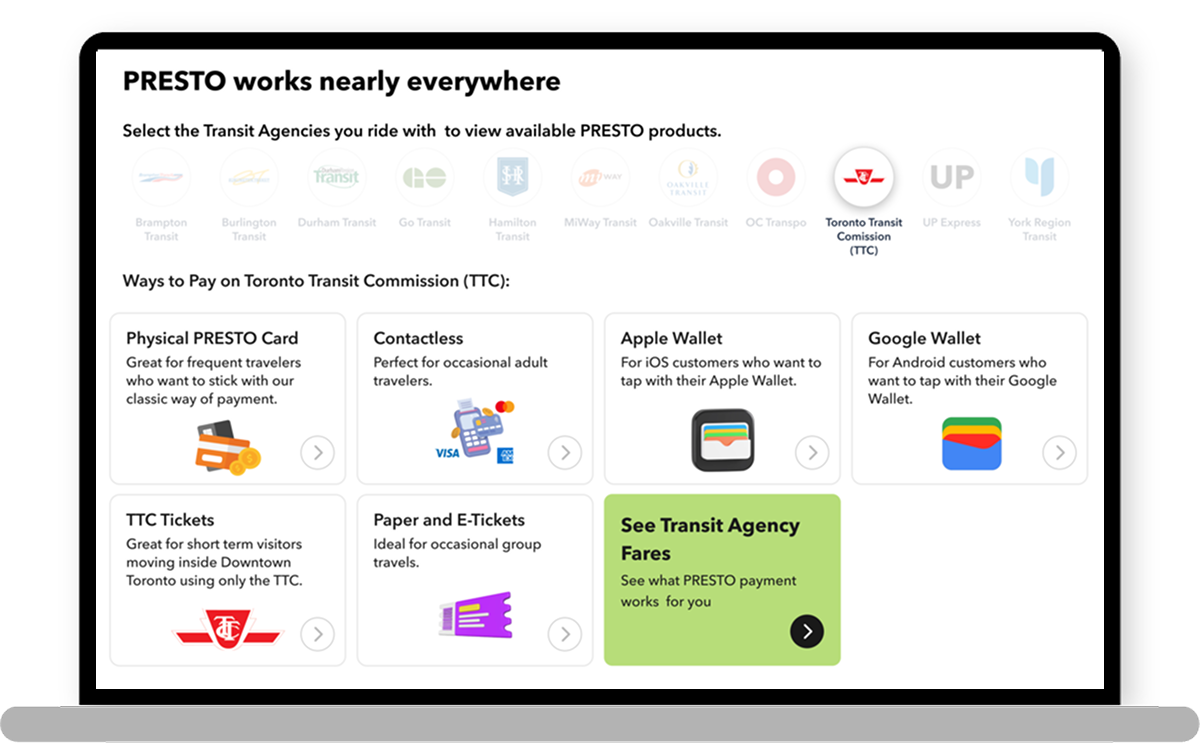
1. Clear larger illustrations
2. Key information easily accessible with concise, scannable text
3. Reduced repetition of the word “PRESTO” created a cleaner, more focused experience
4. Clear labels, visuals, and interaction showed which transit agencies the product supports
Optimized content and CTA placement
BEFORE
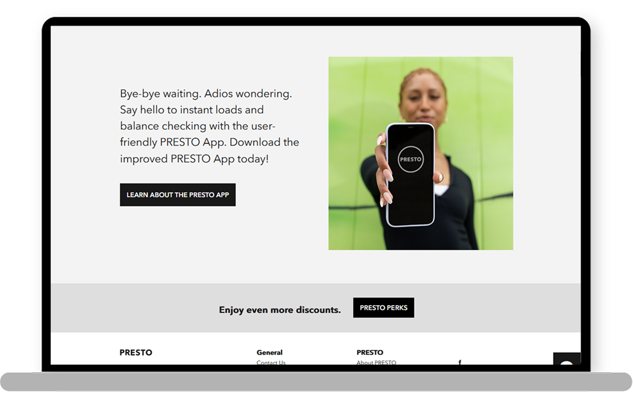
1. Overwhelming amount of text made content hard to scan
2. App download process requires multiple steps
3. Supporting image fails to communicate app features
4. Placement at the bottom of the homepage reduce visibility
AFTER
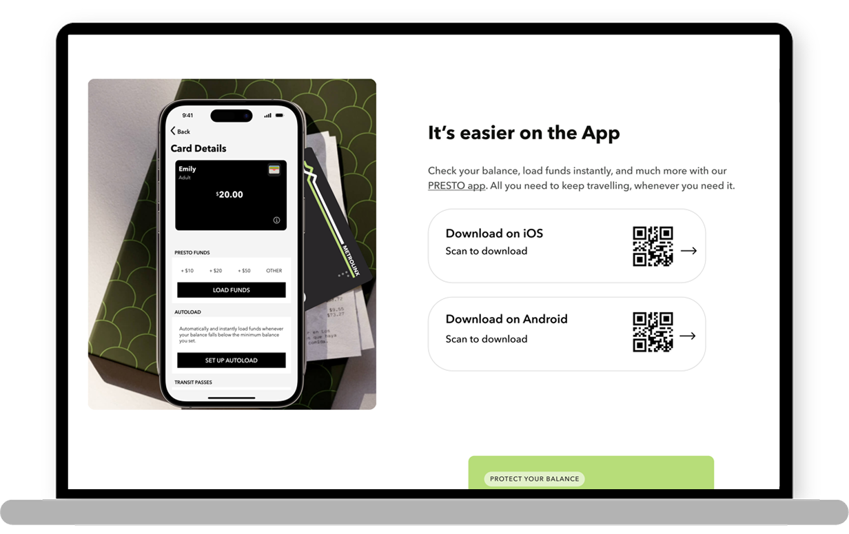
1. Streamlined text made content quick and easy to read
2. Simplified app download with a QR code and direct store buttons
3. Updated image clearly highlighting key app features
4. Moved section higher on the homepage to improve visibility and access
Making room for what matters
BEFORE
1. Excessive white space lacks meaningful content
2. News and ads take up too much space, pushing down key tools like balance, notifications, and cards
3. Navigation bar isn’t scalable, limiting the ability to add future tools as the product evolves
AFTER
.png)
1. White space is balanced with meaningful content to improve usability
2. Key tools like balance, notifications, and cards are prioritized over promotional content
3. Navigation bar is redesigned to be scalable, supporting future features as the product grows
Bento design showcasing valuable tools for riders

Upfront Card Name and Balance
.png)
Easy-to-check Free Transfer Timer

Intuitive Card Management displaying name, number, fare type, balance, and product type (e.g., contactless, Apple Pay, PRESTO card)

Recent transactions are displayed upfront, showing the transit agency, payment method, station, fare amount, date, and time.

Travel Spending Tracker to help customers visualize their daily, weekly, and monthly expenses.

Expandable lateral nav bar with icons and text for accessible, organized dashboard tools
.png)
Troubleshoot made easy
BEFORE
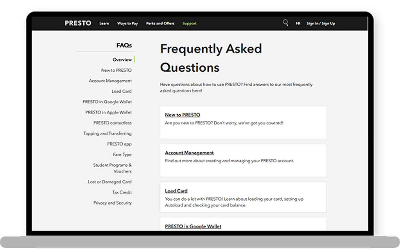
1. Difficult to navigate because it's text-heavy and lacks a clear information hierarchy
2. The two-column layout is redundant, repeating the same content on both sides
3. Without visual or structural hierarchy, all information appears equally important, making it harder to scan or prioritize content
AFTER
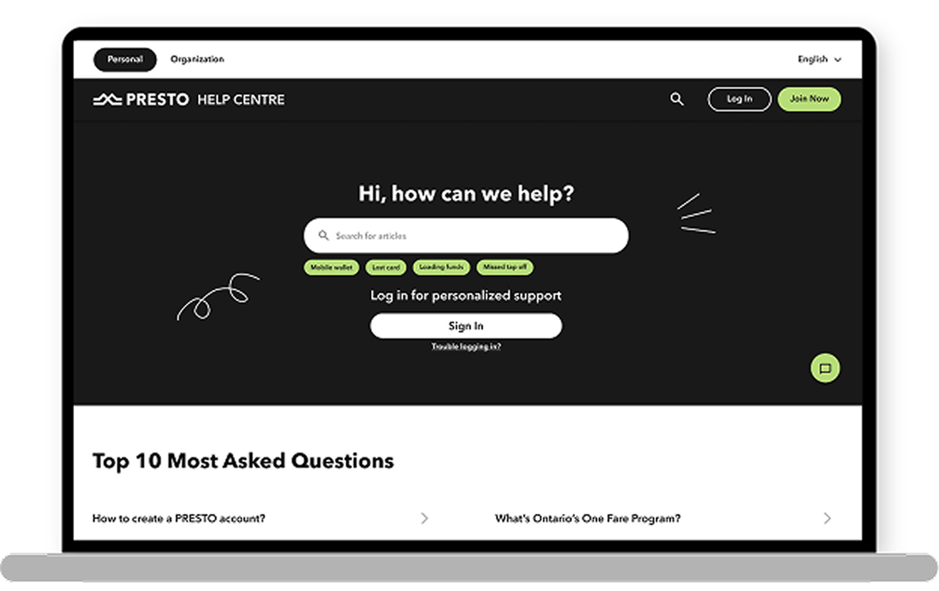
1. Prominent search bar with suggested queries helps users find answers quickly.
2. Sing In button enables access to personalized support and faster service
3. Chat button added for quick, simple inquiries
4. Top FAQs highlighted to surface the most relevant information
5. Language selector supports users in multiple languages
6. Help Centre tailored for individuals and organizations, with dedicated content for each
Optimized lost/stolen card informational page
BEFORE
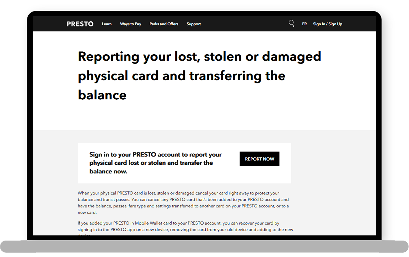
1. Oversized title pushes key info too far down
2. Report button appears too early, leading to confusion for unregistered users
3. Long, thin text layout reduces readability and accessibility
AFTER
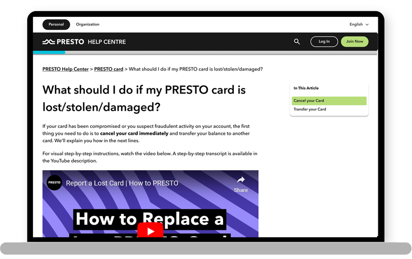
1. Improved navigation with progress bar, sticky side nav, and breadcrumb trail
2. Enhanced readability with thicker text and bold highlights
3. Video placed above the fold for immediate visibility to visual learners
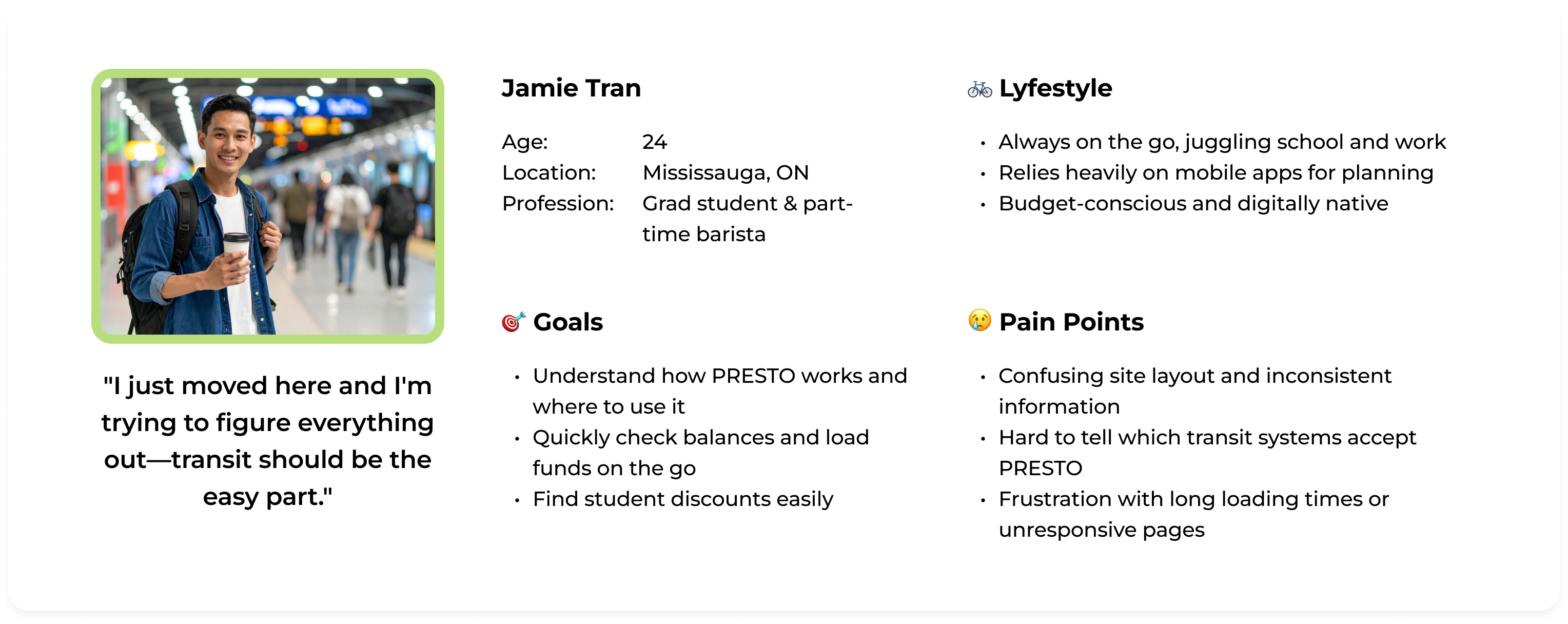
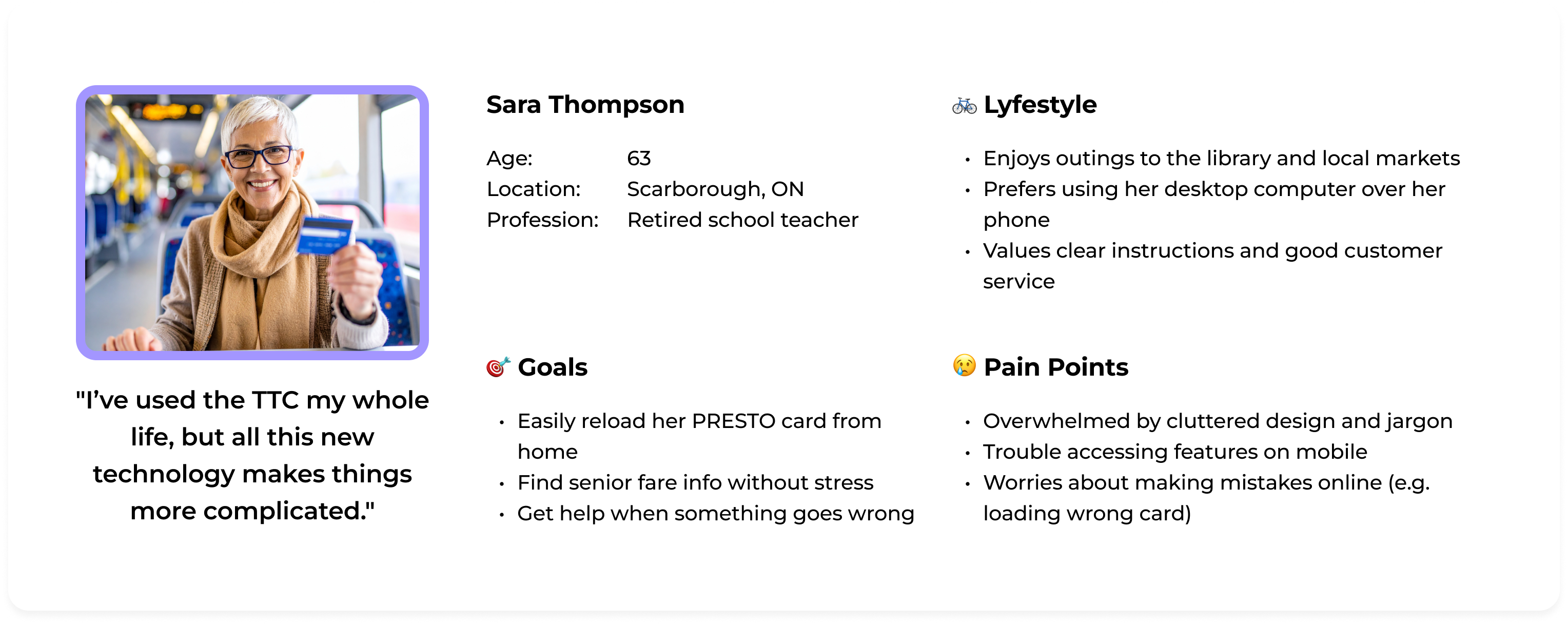
The current PRESTO web app serves over 16 million Ontarian riders, helping them manage their balance and transaction history, manage their account, set up Autoload, troubleshoot issues (such as lost or stolen cards), and understand fare/pass information.
However, the lack of clear information architecture, visual hierarchy, and modern design elements makes it difficult for riders to quickly find what they need and understand the service.
.png)
According to the monthly CSAT (Customer Satisfaction) survey, the number of users who reported that the website feels outdated and confusing has increased by 15% over the past three months.
Transit payment experiences like OMNY and Oyster often felt outdated and frustrating for users. This prompted the business strategy team to explore Wise’s digital transformation as an aspirational model. Similarly, the design team looked to beloved brands like Starbucks and Wealthsimple for inspiration.
Together, we began to reimagine PRESTO not just as a transit fare tool, but as a full-fledged payment system.
.png)
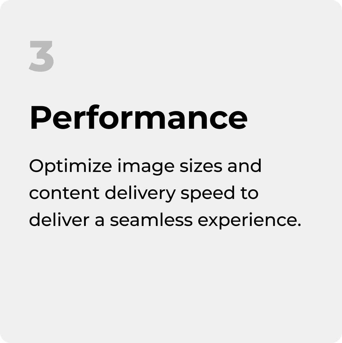
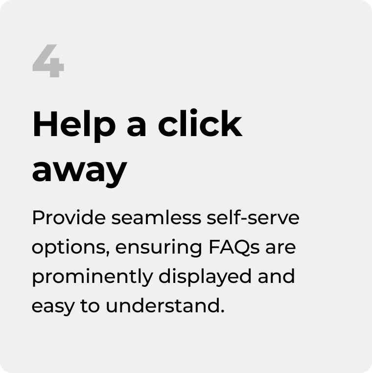
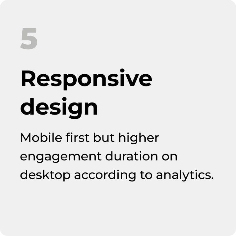
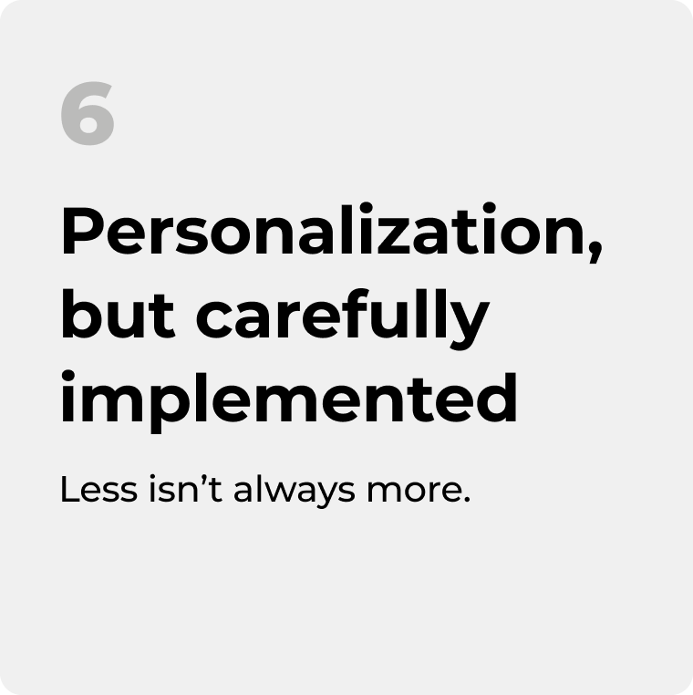
With our learnings from the customers’ feedback and competitive analysis, we established 6 principles. This helped us align as a team for next steps.
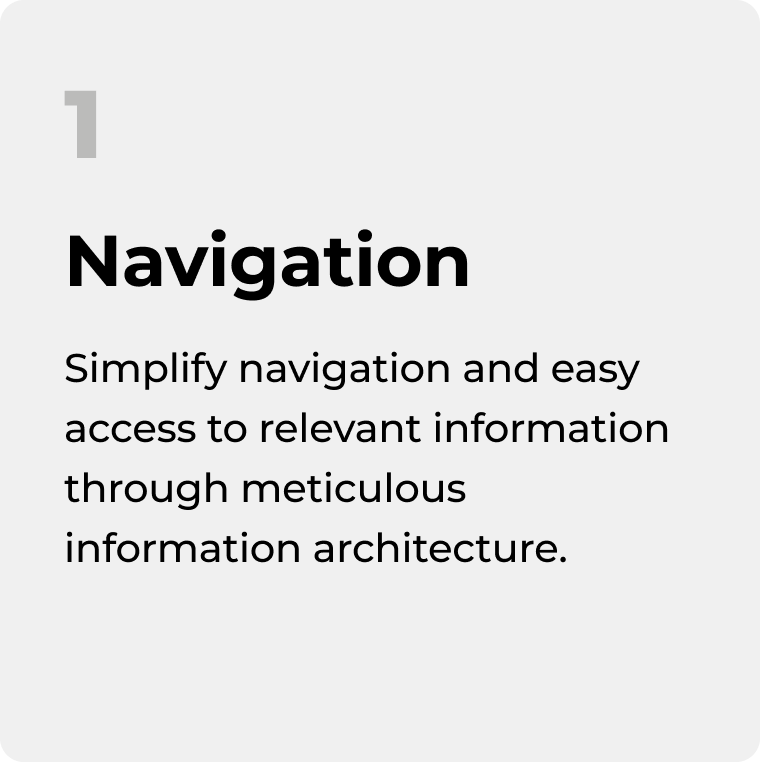
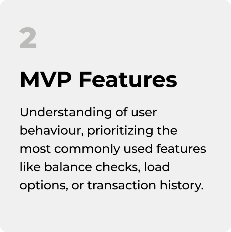
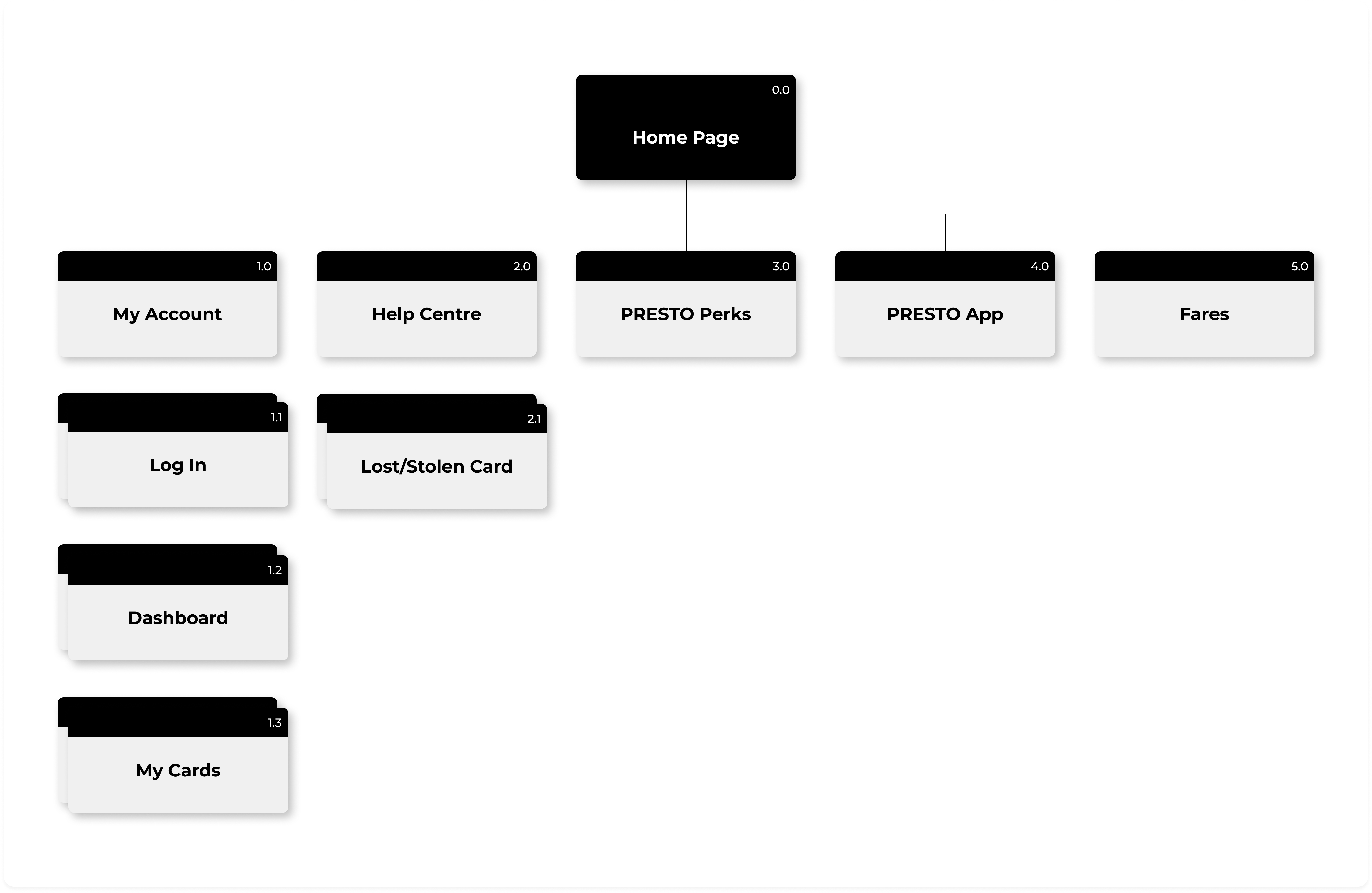
During a team brainstorming session, we identified which pages to prioritize for the redesign. With only two months before the vendor meeting, we focused on pages frequently mentioned in customer satisfaction surveys and those closely tied to high-impact business goals. With this in mind, we created an initial sitemap draft to guide the redesign process.
We quickly aligned as a team and took on complementary roles. Mehdeep and I had UX and UI backgrounds, so we led the research, competitive analysis, UX audit of existing pages, and created low-, mid-, and high-fidelity wireframes in Figma.
Sharon, the project lead, and Aodhan, both with business analysis expertise, focused on refining our designs through feedback, prioritizing pages and functionalities, and supporting the creation of low-fidelity wireframes to communicate business strategy ideas. Finally, Marcela, our accessibility expert, was in charge of conducting the accessibility review for the high-fidelity designs.
.png)
For each page, we audited UX issues, gathered design inspiration, sketched wireframes, and refined them with business and accessibility input to reach high-fidelity designs.
.png)
Once we had the high fidelity versions of all core functionalities in the web, we presented our concepts to the CX and Digital Transformation teams at PRESTO.
During this meeting, we walked through our process and shared the next steps. The redesign was approved to move forward the next phase: conversations with the provider.
The new web is set to launch at some point in 2025 🎉 Stay tuned!
.png)
